Map
The Map page visualizes the geographic distribution of sessions across your XR program. Use it to identify regional hotspots, deployment coverage gaps, and the global footprint of your experiences.
The project and year slicers in the right column apply to all visuals on the page.
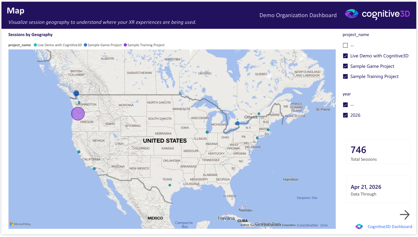
Total Sessions
The total number of sessions captured across the selected projects and time range. Provides context for the geographic distribution shown on the map.
Sessions by Geography
An interactive map showing session density by location. Each marker or region represents the volume of sessions originating from that area. Zoom and pan to explore specific regions.
Geographic data resolution is approximate and intended for portfolio-level pattern recognition rather than precise location tracking.
Data Through
The most recent session date represented in the dashboard. Reflects the last successful pipeline refresh from Cognitive3D.
![]() If you have a question or any feedback about our documentation please use the Intercom button (purple circle) in the lower right corner of any web page or join our Discord.
If you have a question or any feedback about our documentation please use the Intercom button (purple circle) in the lower right corner of any web page or join our Discord.